Sorry the text is hard to read because of bad choice of a mono-spaced font, bad overly-distressed design choices, and a rare (for me) bad exposure of the maroon layer. The so-called perfect storm
of making it hard to read. The text is below:
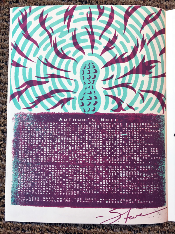
Author's Note:
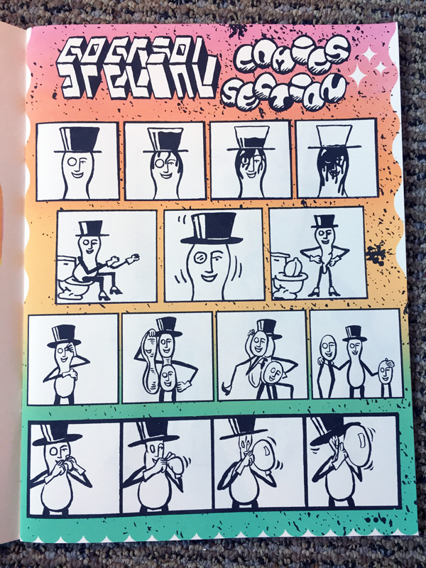
When this book was about 80% completed I decided to do research
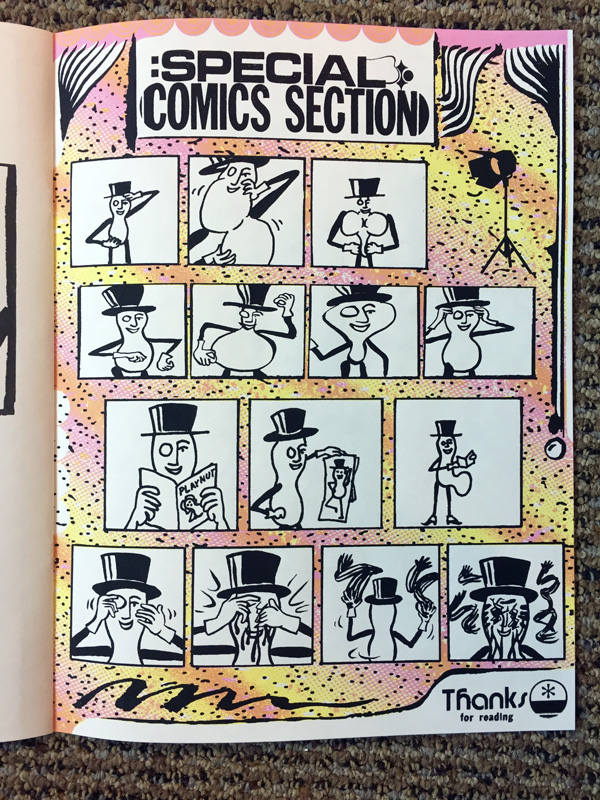
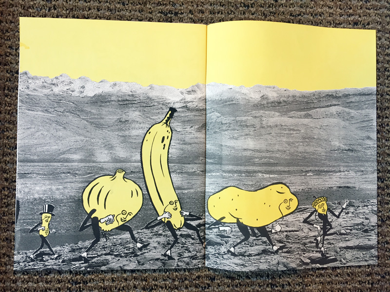
for it (big mistake) by google image searching mr peanut drawing
and to my extreme dismay learned about an artist named Vincent Trasov who spent basically his entire career doing drawings of Mr. Peanut in incongruous situations, like 50 years ago. He even ran for Mayor of his hometown of Vancouver, Canada
as Mr. Peanut, constructing an elaborate foam costume of the beloved character that he wore at all times, for some kind of social satire reasons presumably. Man, it must have been good to be an artist in the 70s, you could just come up with a single idea and do your whole life's work on that one idea and you become a famous artist, and also you can afford health insurance, and your rent is like $80 to live in New York City, or Paris, or wherever. (Or Vancouver, Canada
, in the case of Vincent Trasov.)
But I digress, my point is that while Mr. Trasov apparently had throroughly strip-mined the fertile hills of Drawing Mr. Peanut In Incongruous Situations
over the decades of his successful art career, he used the more realistic 1920s - 1950s character design, whereas for this book I used the cartoonier 1962 Mr. Peanut re-design, or specifically the more flat
90s update of it. I found this out through my further research (google image searching mr peanut timeline
). Also my own work employs various chill
and trippy
imagery, rather than like Greek Antiquity or whatever. So it's totally different.
The less said about the most recent 2010 3D computer-modeled Mr. Peanut re-design the better.
-Steve
Thanks, and again sorry.
-Steve
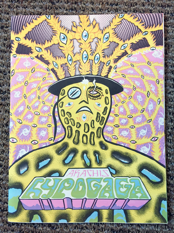
Arachis hypogaea (the scientific name for the peanut)
9" x 12"
October 2019